

Trying to pick the greatest hits from almost twenty years of work isn’t easy.
I tried to pull the most relevant things, but if there’s something you’d love to see that I haven’t included, let me know. I likely have samples.
Design
Just about everything here incorporates some design, but other sections are more illustration based, or focus more on traditional media. These are things that mostly showcase design work.

Design and layout for Hear Me 101 manual

Graphics for Denis Leary
Graphic based on a White Wives lyric, for fun.

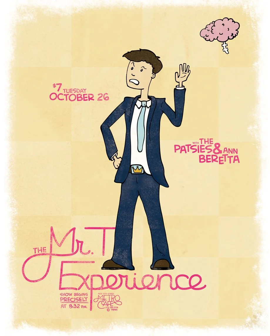
Phenomenauts show poster

Web ad for Wolf Furniture

Mobile ad for Wolf Furniture

Mobile ad for Wolf Furniture
Poster for a fictional series, wherein writers would list their dream acts and locations, and artists would create posters for the hypothetical shows.

Home page redesign for Jefferson Regional Medical Center

Hear Me installation that paired kids' artwork with audio of them explaining it. You could press the button, then listen through the can on a string.

Poster design for Setting Limits, Breaking Boundaries. This was a film series we curated based on films with limitations.

Button pack for an event

New design for Hear Me homepage

New design for HearMe interior page

I pivoted from primarily weddings to mostly newborn photography, and thought that required a little rebrand.

Our local youth baseball league needed an update for their logo
Hear Me was a grant-based project through Carnegie Mellon University that amplified kids’ voices using media and technology. When I started there, we had a logo and a neglected website. As the only designer there, I was quickly tasked with coming up with fresh branding, creating all kinds of collateral within it, and communicating these new brand guidelines to the rest of the team. I worked on everything from billboards, to temporary tattoos, to installation art, to training manuals. We also created a brand new website to appeal more to older kids.
Icons and other Illustrations
Icons are tough, but fun. Trying to pare something down to the simplest representation possible, while still being instantly recognizable is a challenge. This section also includes some spot illustrations and small graphics, which have a similar need to communicate a topic, but allow you more lines to do it with.

I worked with another designer to create these icons for different payload types that Astrobotic would be sending to space.
These were created for different branches of the Hear Me project.
Spot illustration of a phone my kids would never recognize. This was an illustration test for another job.
Logo for the Think Wireless blog
This game, an asynchronous idea based on subway maps, made it through play testing.
At one time, Astrobotic was sending personal belongings along with their payload, and needed small icons to represent what you could send (a pet's tag, sand from a favorite beach, a scout badge, etc.)
Spot illustration for an article on the price differential in merch at punk shows versus metal shows.
These icons were used for different topics on Hear Me's website.
Graphics for a burger game that didn't make it to the coding phase.
Shirts
Working freelance, I’ve made a lot of t-shirts. These are my very favorites.

Twenty One Pilots. The brief mentioned that the band loved hidden messages, and I used Braille in the design of this one.

Steel City Ruby, a true collaborative effort with the team at Carney Co. One of the developers mentioned that the name of the conference sounded like an 80s hair metal band, and we created this. Our skeleton is named Scope Creep.

Pinhead Gunpowder

Minimum wage, maximum damage

Mixtape for Green Day

The Cover Ups

Jello Biafra

Our first year of ice hockey, the only stat we claimed first place for was penalty minutes.
Punk Rock Entrepreneur
I took a conference talk that I gave in Cleveland, Ohio and turned it into a book. The publisher liked the idea of having me do the cover design and interior illustrations, and although it was a huge undertaking, so did I. One project always leads to more, and I ended up designing and screenprinting a poster for my book launch party / punk show, as well as a t-shirt to sell. Because I’m always interested in process, I included some concept sketches for the cover here.


Figure Drawing
I love illustration. If I was stranded on a desert island (that somehow also had electricity, I guess?) and could only choose one program, it would be illustrator. In particular, I enjoy figure drawing. That phrase generally only refers to humans, but I’ve included some favorite animals as well.

I wanted to do a bit of a retro sci-fi vibe for these episode posters. It was a fun exercise in picking a moment that really summed up a particular episode.

The Frustrators have a song about a brown Mercury Comet, and I used that as the basis for this t-shirt graphic. Everything was hand-drawn then cleaned up digitally.

A friend organized a screening of UHF, and tapped a few artist friends to create posters for the event.

My friend Phil refused to wear a full cage for hockey, even though I warned him. I made him this commemorative graphic in the hopes that he would pay more attention to his cartoon self.

This was a practice project. I happened to have a Rolling Stone laying around with these guys on the cover, so I made digital portraits of Green Day to work on illustrating faces.

Artcrank asked me to create a poster based on bicycling that could be screenprinted, and I gave them Girl Gang.
Commissioned piece, a poster for The Mr. T Experience

I was asked to create a fun 404 page. Since we'd been having some trouble with raccoons in the building, I figured we could just go ahead and blame them for any technical issues.

Slothcore. Live slow, die whenever. (Live fast, die young seemed like too much pressure.)
Farm to Table Doodles
I like to work in traditional media as well as in digital. Sometimes a project calls for a screenprint, or a hand drawn element, or a giant Mona Lisa mural.

Mona Lisa mural. This was a joint project with my dad (it's his living room wall). We made a mosaic of the original painting and pulled the black value for each square in the grid. We then used that info to mix ten shades of pink, transferred that to the wall, and basically made a 5' wide paint by numbers.

I did a doodle-a-day project called "Everything Gets Eyebrows." I haven't gotten around to digitizing the entire series, but some are available on instagram, and I made a few zines. The header graphic for this page is a collection of my favorites.

Commissioned piece for a charity event, it's The Thing playing the accordion.

I used to see a huge amount of job listings for CSS Ninjas and Code Rock Stars and the like. I wanted to draw the best candidate for the job.

One of the slides I created for my WMC talk. To make the deck cohesive, I used these watercolor brushes and hand lettering throughout.

Interior illustration for a songbook, hand drawn and lettered. I am especially proud of the five dollar bill.

Linoleum block print

Doodle commission, a profile pic in derby gear

Proposal for a book cover. They asked for a rabbit smoking a cigarette, and I think I delivered.
Photography
I spend much of my time these days on photography, and have opened up my own studio. It’s great for branding work, product shots, and video projects.


